Exploring the dark side of UI design
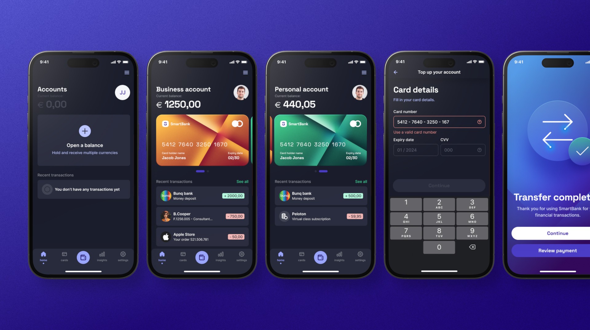
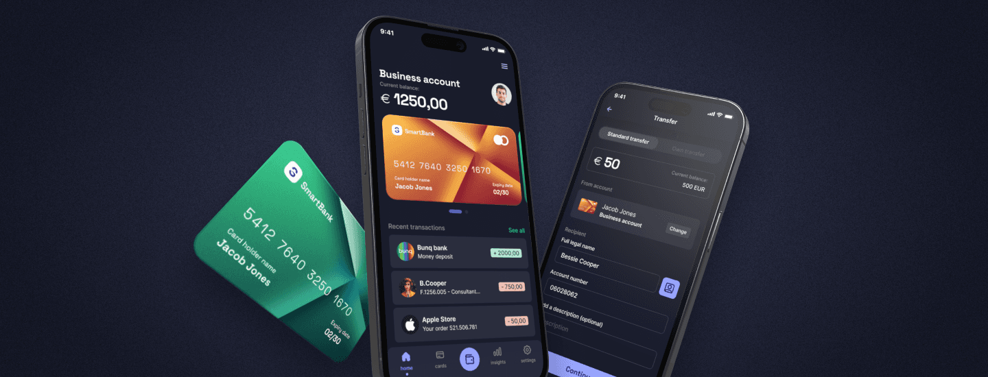
This portfolio project highlights a concept for a mobile banking app, which primarily focuses on UI design. It provided an excellent opportunity to practice and create a modern and sophisticated interface for a digital banking platform. And I wanted to take it one step further by opting for a dark theme mobile app. A challenge that allowed me to push my creative boundaries and expand my skill set. Overall, this project provided me with valuable learning opportunities that I can apply to future projects.
Client
Personal project
Role
UI Design
Time
2023
Time
2023
01
Moodboard
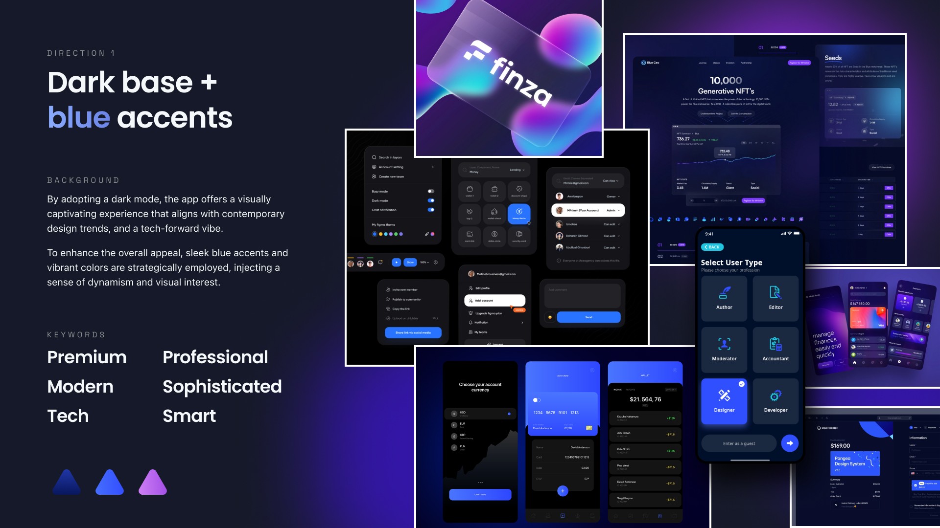
To ensure a clear vision for the app's overall aesthetic, I started by creating a mood board. The aim was to create a modern and premium feel. To achieve this, I opted for a dark mode theme, which is becoming increasingly popular in the digital design world. Throughout the design process it served as a guide and helped to create a cohesive and consistent look across all screens and components.


02
Color palette
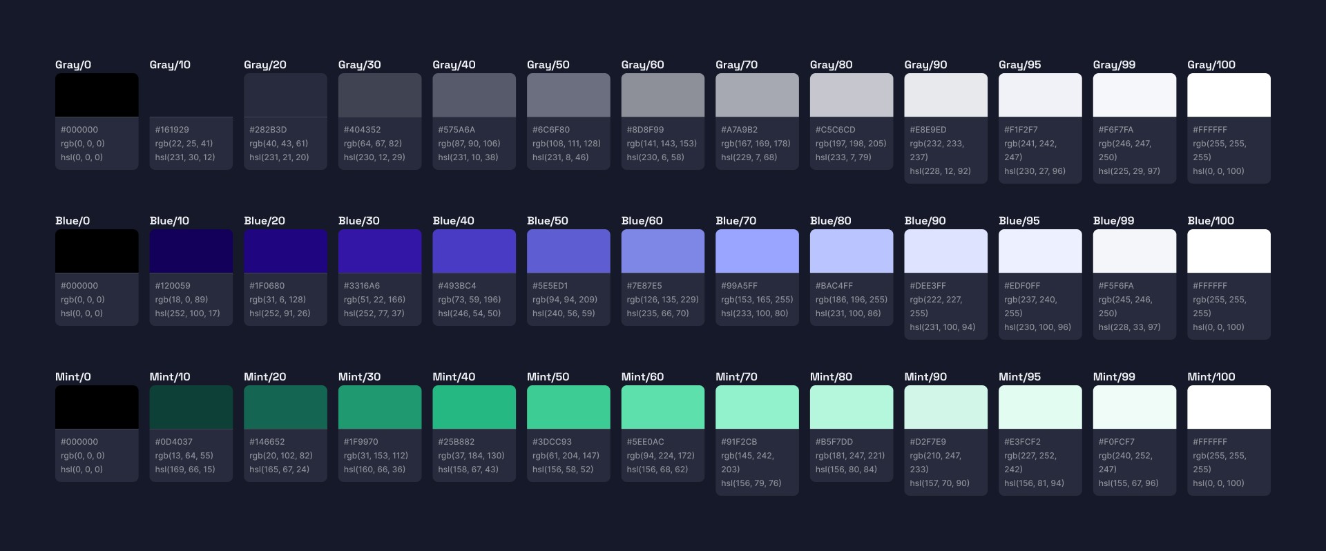
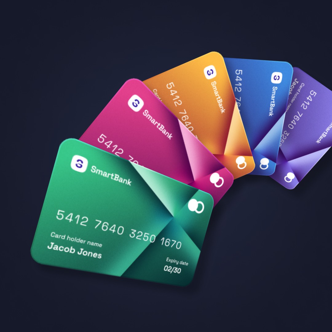
For the color palette of the app, a combination of blues and cool grays were selected to convey a sense of sophistication and trustworthiness. To enhance the user experience, I decided to use muted colors for the interface elements in the dark mode theme. To create contrast, I incorporated more vivid and vibrant colors and gradients for the backgrounds and credit cards, giving the app a more dynamic and lively feel.


03
Typography
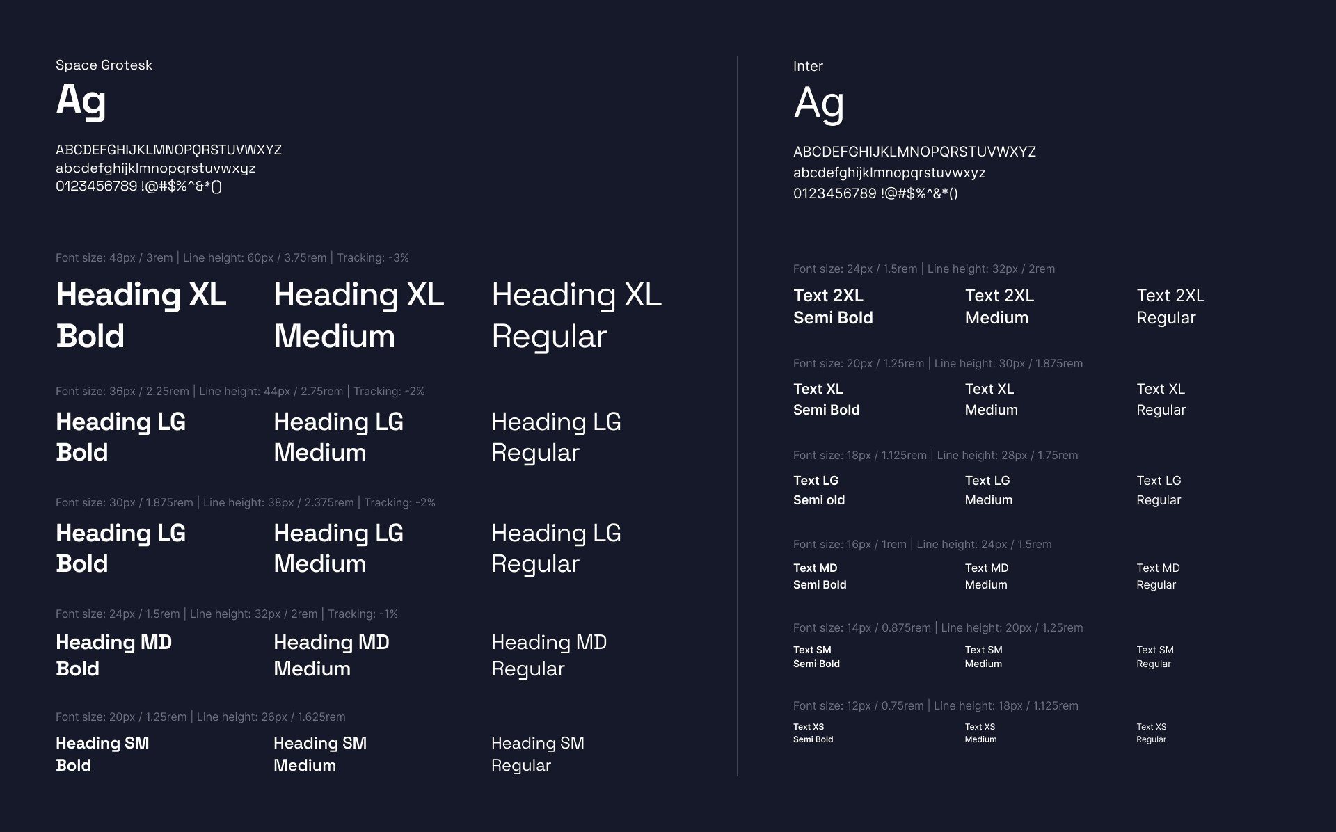
The goal was to achieve a sleek and minimalistic look that emphasizes the app's content, while also providing easy legibility in smaller interface components. To achieve this, a primary font was chosen that reflects the app's contemporary feel. Additionally, a secondary font was added that works well with the primary one, providing greater versatility and enhancing the app's overall legibility.


04
Components
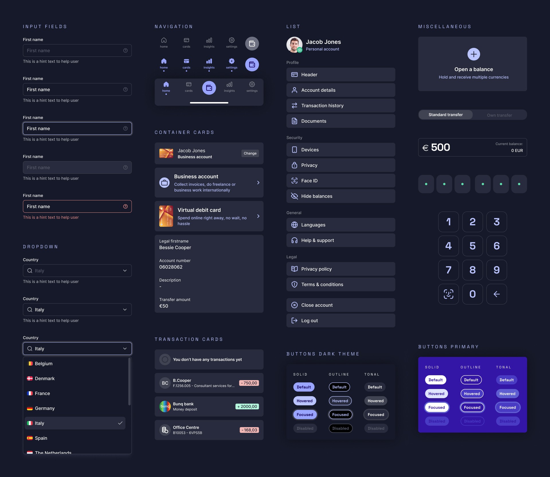
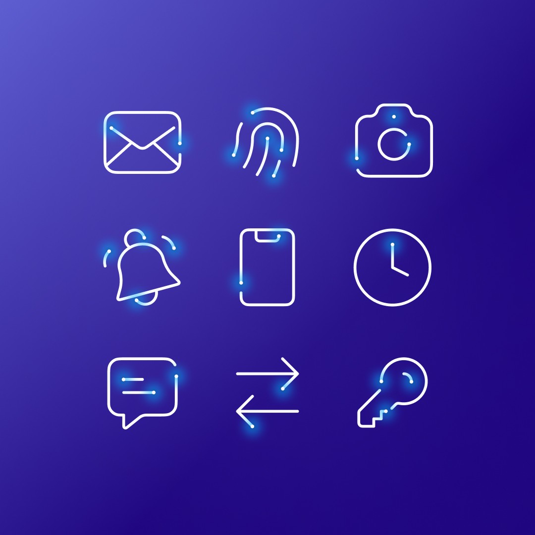
Next on the list was creation of responsive and reusable components, such as buttons, inputs, cards etcetera. Keeping in mind the various states and use cases of the components.
I utilized Figma’s auto layout, constraints and component properties to ensure consistent spacing and layout, as well as responsive behaviour. This made the components easily interchangable and adaptable, seamlessly intergrating in different screens and layouts, and helped to create a visually appealing and functional design.








05
Final designs
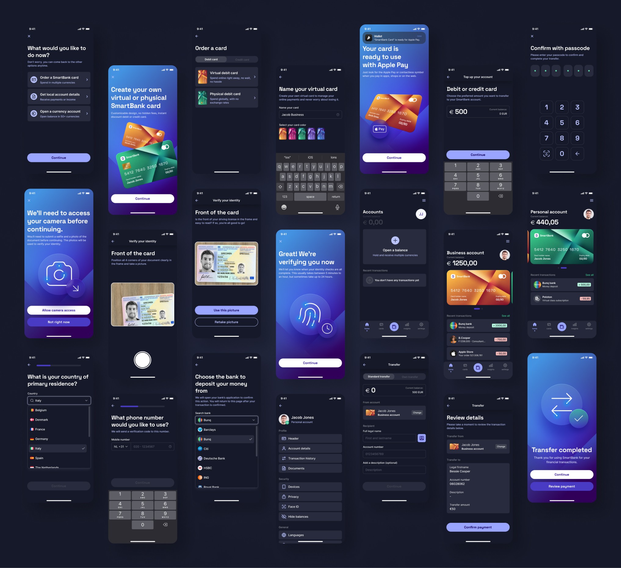
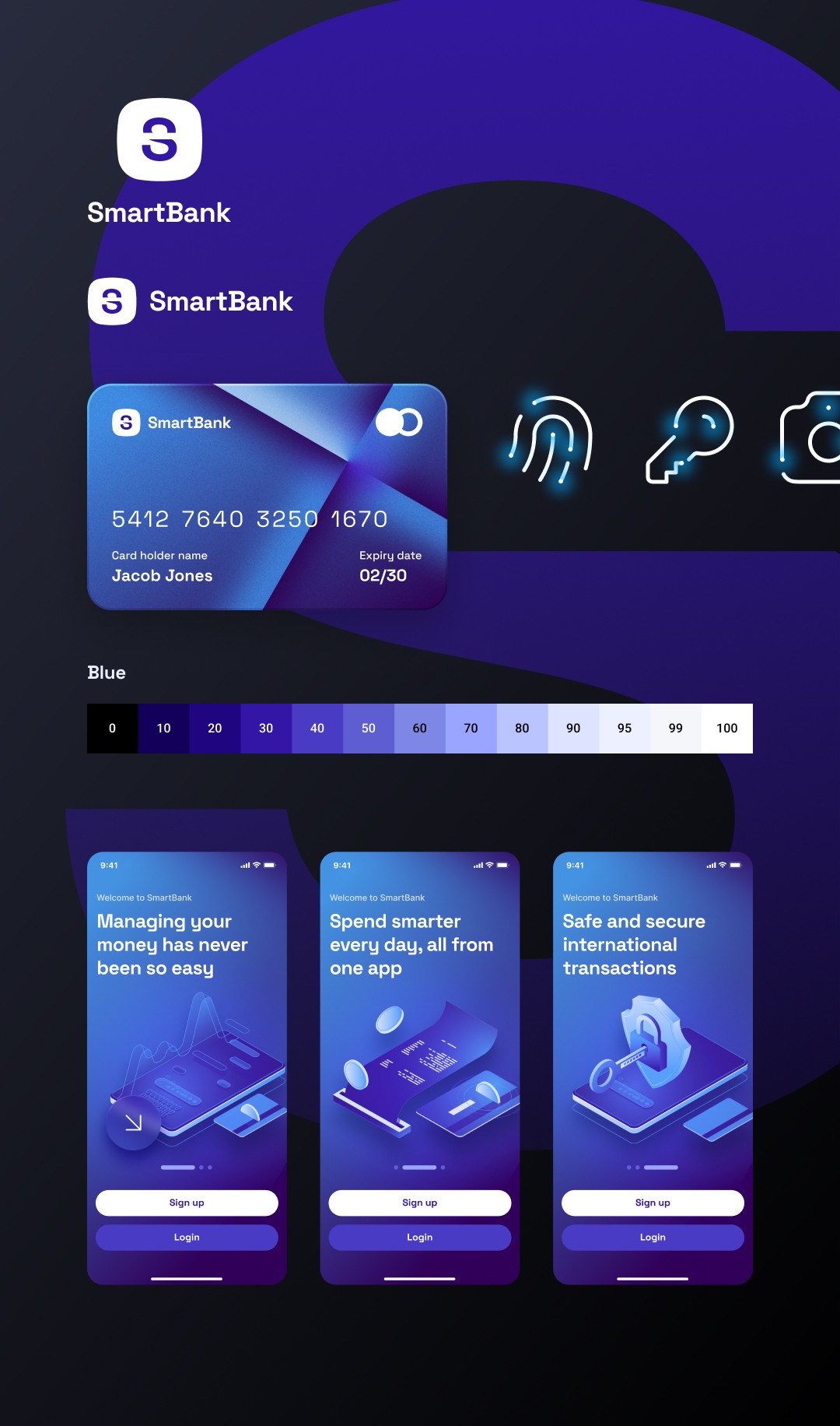
The final designs for the SmartBank app showcase a sleek and sophisticated user interface with integrated components throughout the various flows such as walkthrough, verification, and account setup etc. The dark mode theme is carried throughout the app, creating a cohesive and modern look, with the credit card designs and confirmation screens adding a pop of color and personality to the app.
