Get your arrows ready. Navigating towards less sugar
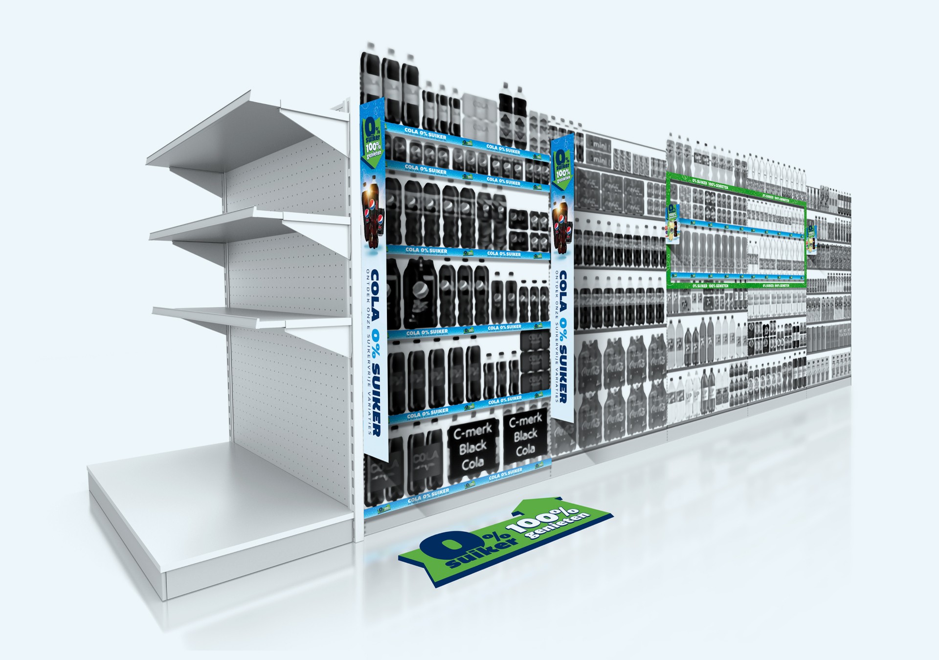
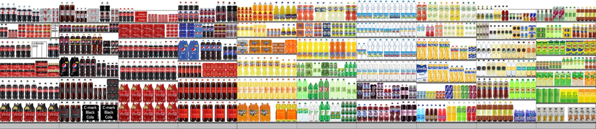
There are many sugar-free drinks available in the soft drink aisle, but they are spread across the shelf. This makes it challenging for shoppers to locate them, resulting in them still selecting high-suger options. Together with the retailer, Vrumona wanted to take the step to make it easier for consumers to find the healthier choice on the shopping floor.
Client
Vrumona & Hoogvliet Supermarkten
Role
Visual design, execution
Time
2020
Time
2020
Get your arrows ready. Navigating towards less sugar
There are many sugar-free drinks available in the soft drink aisle, but they are spread across the shelf. This makes it challenging for shoppers to locate them, resulting in them still selecting high-suger options. Together with the retailer, Vrumona wanted to take the step to make it easier for consumers to find the healthier choice on the shopping floor.
Client
Vrumona & Hoogvliet Supermarkten
Role
Visual design, execution
Time
2020
Time
2020
01
Project brief
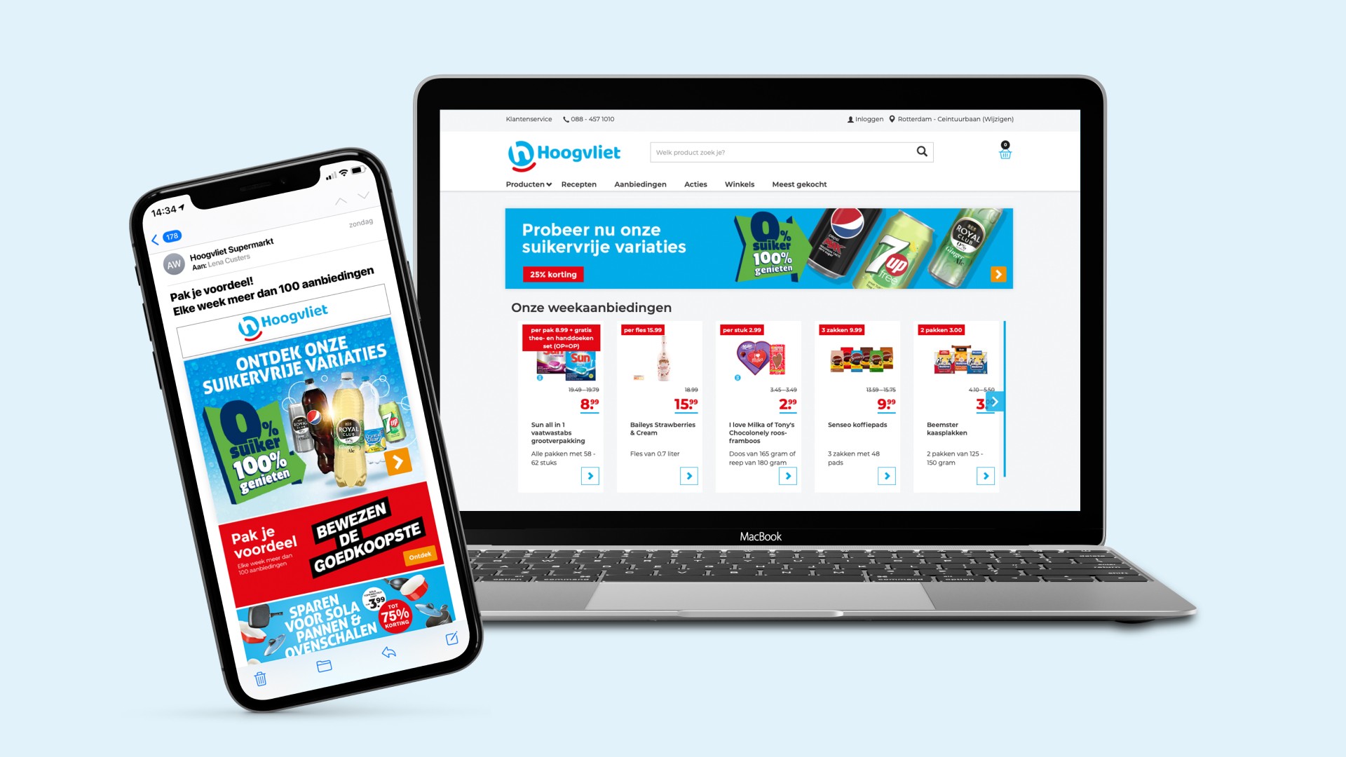
With a portfolio that is 60% low-calorie or calorie-free, Vrumona is the nr. 1 healthy soft drink manufacturer in the Netherlands. Develop a 360-degree (omni-channel deployable) activation platform to create visibility/awareness among shoppers about the presence of caloree-free soft drinks and to activate them towards this healthier choice in the soft drink aisle.
01
Project brief
With a portfolio that is 60% low-calorie or calorie-free, Vrumona is the nr. 1 healthy soft drink manufacturer in the Netherlands. Develop a 360-degree (omni-channel deployable) activation platform to create visibility/awareness among shoppers about the presence of caloree-free soft drinks and to activate them towards this healthier choice in the soft drink aisle.
02
Goals
To create awareness among shoppers and activate them towards healthier options on the shelf.
Encourage existing buyers to switch from full-sugar drinks to sugarfree alternatives.
Attract new buyers who normally skip soft drinks due to the perception that they are unhealthy.
Encourage retailers to rearrange the shelf space and allocate a dedicated section for sugar-free drinks, thereby prioritizing health higher in the consumers decision-making process, which can lead to a higher frequency of purchases over the long term.
03
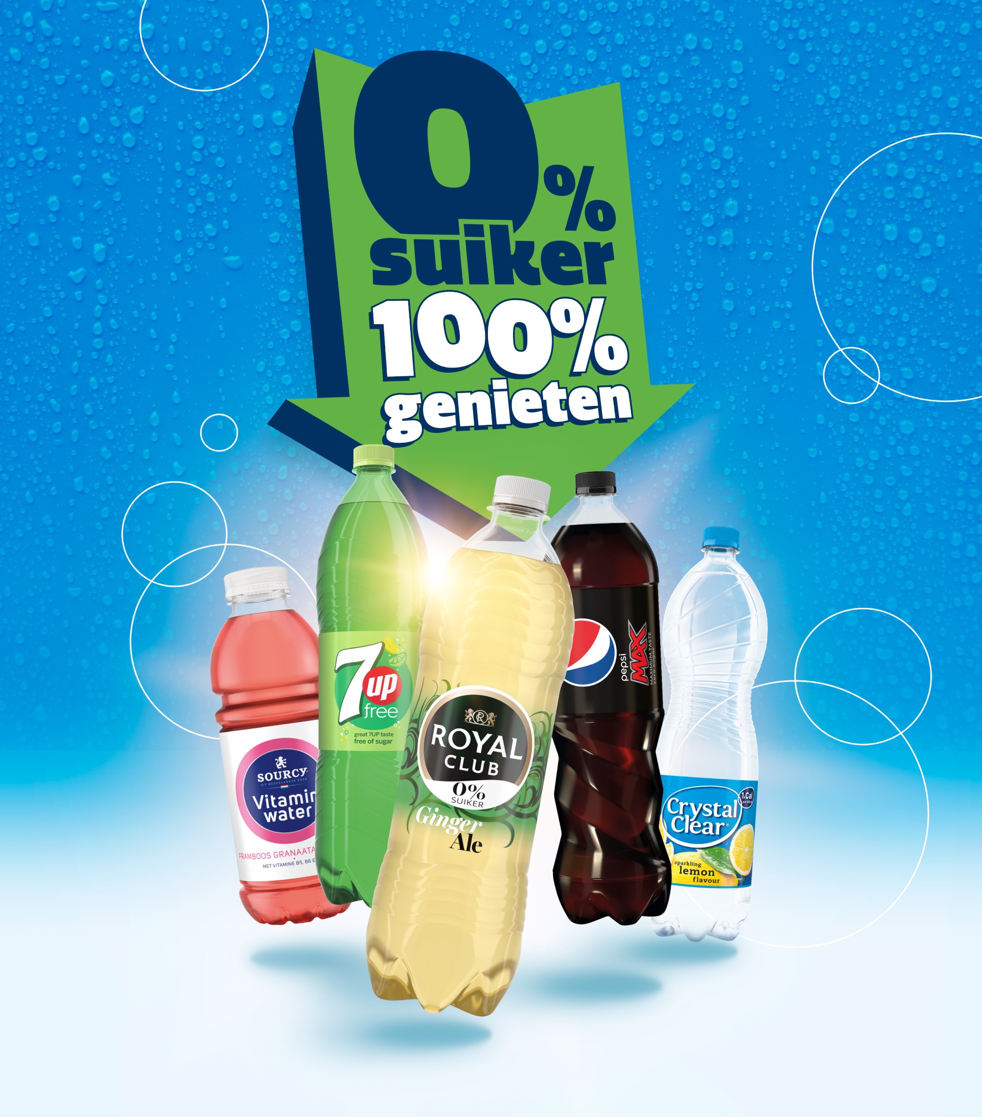
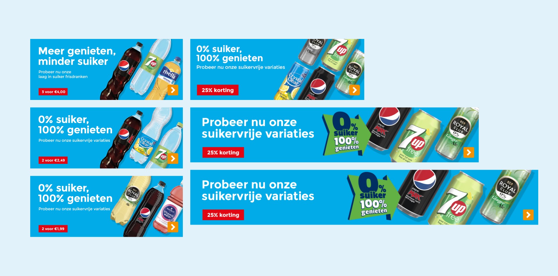
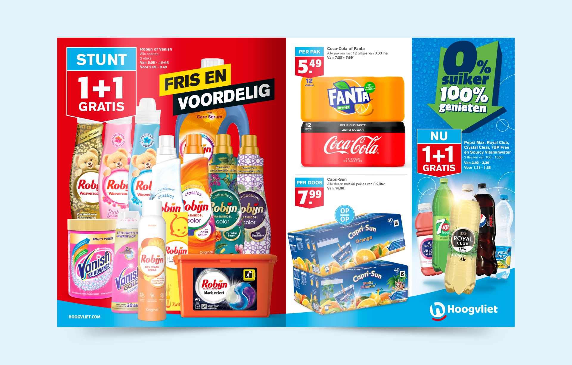
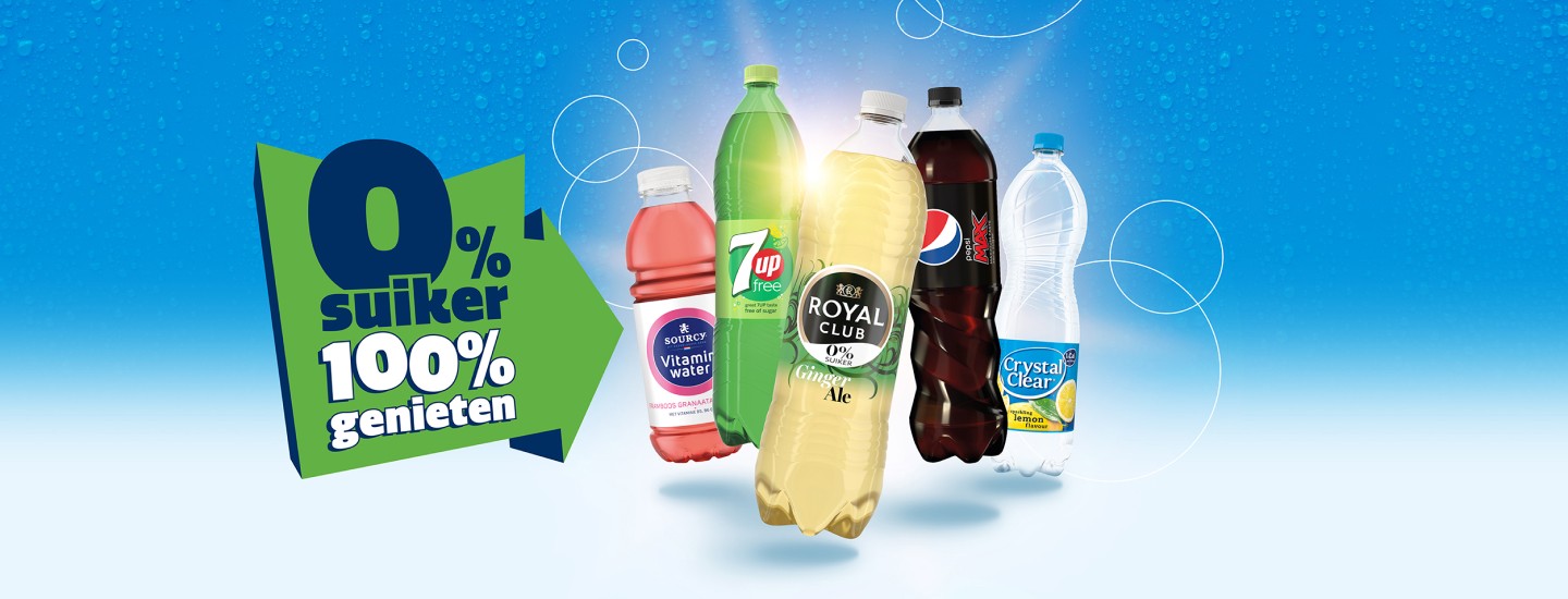
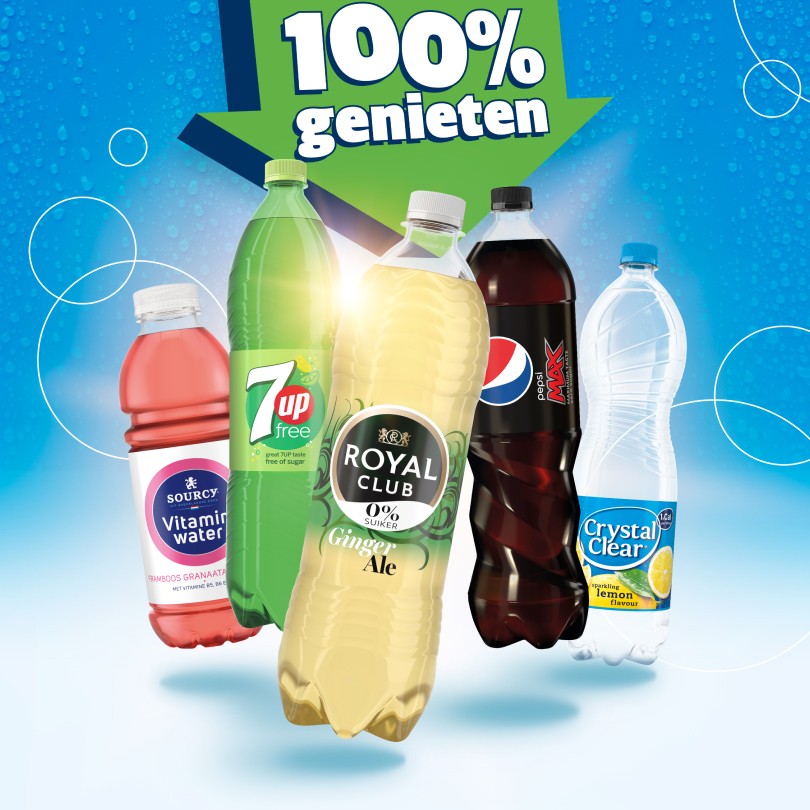
Concept
While health is important, taste and enjoyment remain significant motivators for shoppers in the soft drink category. By using the slogan "0% sugar, 100% enjoyment" these two factors are brought together in a simple, concise but clear message.
Light blue is a color that is frequently used and associated with light products and 0% alcohol in various other categories, making it an ideal signal color for creating a direct link with health-conscious products.
The use of floating products, droplets, and circles adds an element of freshness and fizziness, keeping it light and fun. This contributes to the lightweight nature and enjoyable character of the products.
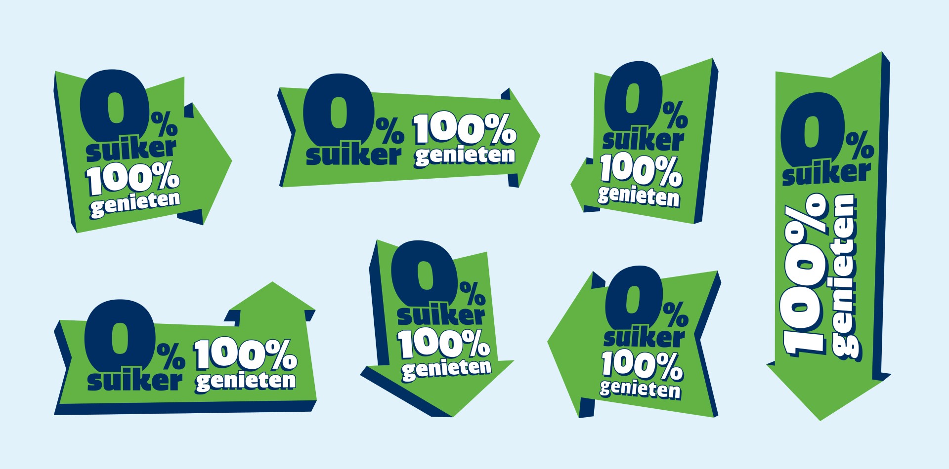
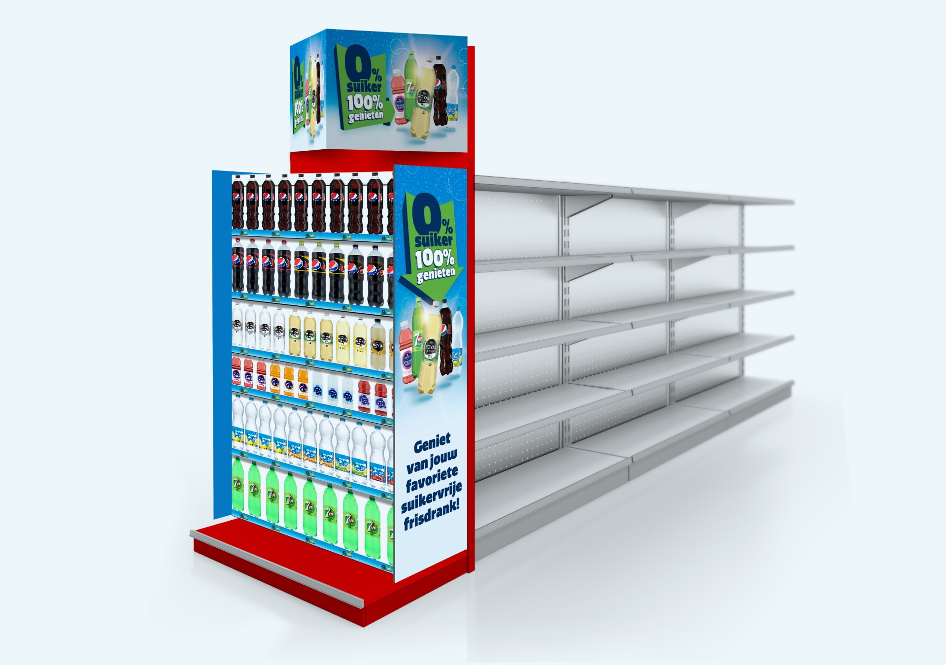
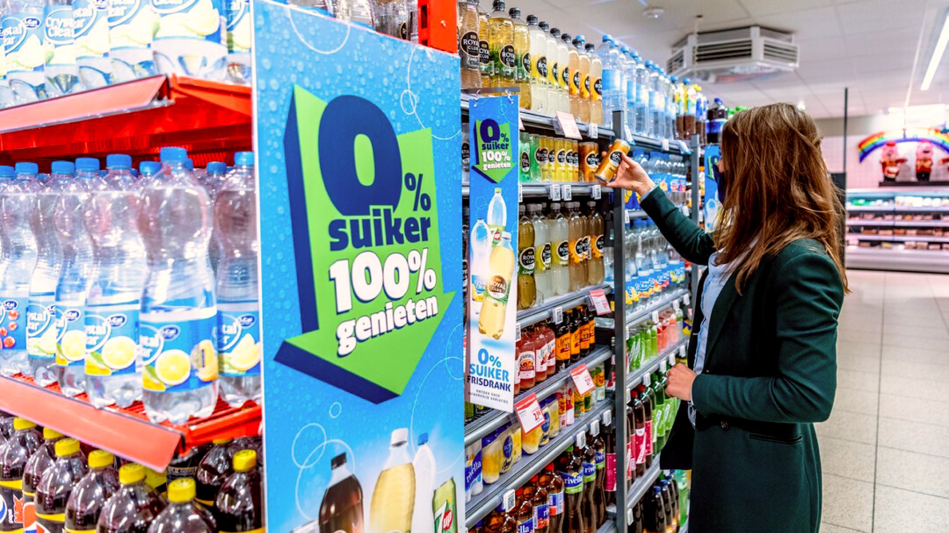
We used arrows as a visual element to create visibility for the key message. In this compact form, it's easy to use in translations across various touchpoints, and at the same time, it serves as a navigation tool that guides shoppers to the soft drink aisle and focuses their attention on the sugar-free options.
03
Concept
While health is important, taste and enjoyment remain significant motivators for shoppers in the soft drink category. By using the slogan "0% sugar, 100% enjoyment" these two factors are brought together in a simple, concise but clear message.
Light blue is a color that is frequently used and associated with light products and 0% alcohol in various other categories, making it an ideal signal color for creating a direct link with health-conscious products.
The use of floating products, droplets, and circles adds an element of freshness and fizziness, keeping it light and fun. This contributes to the lightweight nature and enjoyable character of the products.
We used arrows as a visual element to create visibility for the key message. In this compact form, it's easy to use in translations across various touchpoints, and at the same time, it serves as a navigation tool that guides shoppers to the soft drink aisle and focuses their attention on the sugar-free options.